⏱ 1 min read
The Short Version
A viral tea extraction infographic is spreading scientific nonsense, using polished visuals to mask fundamentally broken math and misapplied data. It’s a textbook warning of how AI-generated content allows pseudo-experts to weaponize professional-looking charts that lack any empirical reality.
In This Article
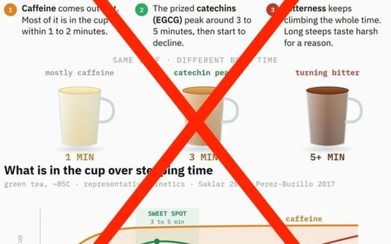
Real talk: a viral infographic claiming to map caffeine and catechin extraction is doing more harm than good. While visually polished, the data presented by supplement entrepreneur Dr. William Wallace is fundamentally broken. It relies on misapplied studies and nonsensical curves that ignore how tea actually interacts with water. This is a case study in what happens when pseudo-scientific authority meets ungrounded digital content.
The curve in the infographic is at best simplified to oblivion.
Misapplied Data and Broken Curves
The graphic attempts to synthesize findings from researchers like Saklar and Perez-Burillo, but it fails the basic math of extraction. A synthesized curve is scientifically impossible here because the creator ignores critical variables: the studies used vastly different leaf types—ranging from Rize green tea to bagged Assam black—and varying water temperatures. Furthermore, the representation of catechin levels in black tea is absurd; since oxidation transforms catechins into thearubigins, their presence should be significantly lower, yet the infographic presents a wildly inaccurate peak between three and five minutes. The curve in the infographic is at best simplified to oblivion.
When you look closer, the internal logic collapses. The visual suggests a specific timing for bitterness that doesn’t align with the actual correlation between caffeine and catechin extraction. In reality, an accurate curve for bitterness would require calculating the sum of both compounds, rather than relying on the distorted timelines provided by this misleading source.
The Rise of LLM Bullshit
What makes this particularly dangerous is the source behind the misinformation. Wallace, who holds an online PhD and co-founds a supplement company, appears to be using Large Language Models (LLMs) to churn out high volumes of content. These models are excellent at mimicry but terrible at scientific rigor; they can produce a professional-looking chart that lacks any grounding in empirical reality. This creates a feedback loop where “experts” publish rapid-fire, AI-generated nonsense that looks authoritative to the untrained eye. We must treat these polished digital graphics with extreme skepticism if they aren’t backed by verifiable methodology.
Is it time we demand more transparency from the “experts” flooding our feeds?
Questions & Answers
Why is the tea extraction infographic created by Dr. William Wallace considered scientifically inaccurate?
The infographic is scientifically flawed because it relies on misapplied studies and ignores critical variables like leaf type and water temperature. By synthesizing data from diverse sources ranging from Rize green tea to bagged Assam black tea, the graphic fails to account for how different leaves react to brewing. Additionally, the visual presents an impossible curve for catechin levels in black tea by failing to recognize that oxidation transforms these catechins into thearubigins during processing.
How do Large Language Models contribute to the spread of scientific misinformation online?
Large Language Models contribute to misinformation by producing professional-looking content that lacks empirical grounding and scientific rigor. These AI tools are highly effective at mimicry, allowing creators to churn out high volumes of polished digital graphics and text that appear authoritative to untrained viewers. This capability creates a dangerous feedback loop where experts use AI to publish rapid-fire nonsense that looks visually convincing but is fundamentally disconnected from actual scientific reality.
What factors must be considered to accurately calculate tea bitterness during brewing?
An accurate calculation of tea bitterness requires determining the combined sum of both caffeine and catechin extraction levels. The flawed infographic fails this logic by providing distorted timelines that do not align with how these compounds actually interact with water. Rather than relying on simplified or nonsensical curves, a true representation of bitterness must account for the specific correlation between these two components as they are released during the steeping process.
What specific errors exist in the representation of catechin levels in black tea?
The primary error in the representation is the presentation of an inaccurate peak for catechins occurring between three and five minutes of brewing. In reality, the oxidation process inherent in black tea production transforms most catechins into different compounds known as thearubigins. Because of this chemical transformation, catechin levels should be significantly lower than what the infographic suggests. The visual curve is therefore a product of oversimplification that ignores basic tea chemistry.
Originally reported by Reddit Tea.