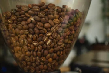
Let’s talk about coffee packaging that doesn’t just look good—it tells a story. Cravens Coffee in Spokane, Washington, has reimagined its bags to honor its 30-year legacy while embracing modernity. The redesign, crafted with Sally Morrow Creative, is a masterclass in balancing heritage and innovation. Instead of abstract visuals, the new packaging grounds itself in the coffee’s origins, using subtle patterns and warm tones to evoke the farms where beans are grown.
The design leans into tone-on-tone illustrations, a quiet rebellion against flashy branding. A repeating pattern of coffee leaves, fruit, and harvesting scenes weaves through the bag, each element a nod to the labor and care behind every bean. Short, impactful callouts like “Quality takes work. It sure is worth it” and “Respect the farmer. Reveal the flavor. Reward the drinker” reinforce Cravens’ commitment to ethical sourcing. These aren’t just words—they’re a promise etched into the fabric of the packaging.
The color scheme is a warm, muted palette that feels both timeless and contemporary. Crisp rectangular color blocks on a light background create a “billboard” effect, making it easy to distinguish blends, single-origin offerings, and seasonal releases. It’s a visual language that speaks to both the coffee’s journey and the consumer’s desire for clarity. The design doesn’t just showcase the product—it honors the people behind it.
Cravens and Sally Morrow Creative didn’t stop at the bag. The redesign extends to the retail environment, where a copper-toned header panel anchors the display, and modular fixtures organize bulk bins, bagged coffee, and equipment. Every detail is a thread in the same story: from farmer to roaster to customer. As Sally Morrow put it, “We wanted the brand to reflect the people and relationships behind every bag.”
The design’s clean, rectangular color blocks create a strong visual identity that distinguishes different blends and releases.
Key points: The new Cravens packaging uses tone-on-tone illustrations to celebrate coffee’s origins and craftsmanship. The design’s clean, rectangular color blocks create a strong visual identity that distinguishes different blends and releases. The retail kiosk redesign extends the brand’s narrative, turning the shopping experience into a story of connection and quality.
What’s your favorite coffee packaging that tells a story? Share your thoughts below.
Questions & Answers
What makes Cravens Coffee unique?
Cravens Coffee uses locally sourced beans and traditional roasting methods. They focus on quality and community, supporting Spokane’s coffee culture with a commitment to sustainability.
Where is Cravens Coffee located?
Cravens Coffee is based in Spokane, Washington. They operate multiple locations in the area, offering a blend of quality coffee and a welcoming atmosphere for locals and visitors.
Information sourced from industry reports and news outlets.